By Natascha Roeoesli Web: www.tascha.ch Email: n@tascha.ch
Line:
Theoretical description:
“Line is just a connection of 2 points and it can be straight or curve. There are many types of line, but most lines can be simplified and represented by a combination of straight curves”
In regards to art:
Lines are specially important for special kind of art (drawings, comics, inking).
Line weight is particularly important in this case. Even lines make for a boring effect as where as different line-weight can make something more interesting. Besides it is used to hint at shapes (this would go towards inking and that would be a whole little section on its own ) Depending on what you want to achieve/say the left or the right might be more interesting. Sometimes you don’t even have to draw the whole line but a hint of an ending works much better.

Values:
Theoretical description:
“Value is how light or dark something is. Value can be determined by the local tone or color of something or by how light interacts with something (creating highlights, halftones and shadow).”
In regards to art:
Values are probably the most important aspects to consider. They are also the reason that we like black and white illustrations a lot. It is much harder to achieve the right values with colors. This is mainly the case because the more value something has the less hue of the actual color it shows. I hope I am not wrong here but most of the time we just use “brightness” instead of value. However Value is actually the relationship between the brightness of one color in regards to another.
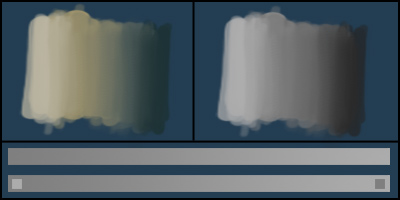
Look at this gif: The grey a middle value and it’s exactly the same on both sides (128, 128, 128 - a neutral grey): It does look warmer while surrounded by cold colors and appears to be colder while surrounded by warm colors. That means if some elements have the same value they will react on the hue of the surrounding elements instead if you compare them.
Values are extremely important in regards to texture and surfaces as well, how objects interact and to create forms.
It’s always a good trick to desaturate your painting to check how your values are. In general you should have the biggest value contrast around the center of interest because your eye gets drawn to that point automatically. In general you should have most values in the mid range, then less in dark and lighter values. (highlight and shadows).
I think you could write a whole book about values only but generally make sure you have a the whole range from very dark to very light in your painting.
Values are also sometimes tricky to “see correctly” since our brain makes us think that we see a different value than it actually is. That is particularly hard to see if you look at something with a smooth value transient - now tell me you are not a tiiiiiiiiny bit surprised how big the difference from value a to value b is on the bottom bar?
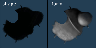
Shape and Form:
Theoretical description:
“Shape is the first thing that you see, in 2d. Basically the silhoutte of something. Shapes are usually very simple at first sight and they easily give us the length, width and proportions of any given subject. There are also light shapes and shadow shapes, etc.”
“Form is what gives something the look of being 3d. It happens in the areas of an object where shadow turns into light, revealing the ‘topography’ or elevations of the surface of something. Subtle gradations of value usually represent smooth surfaces,like a sphere, while sharper shifts in value show surfaces that have solid and sudden plane changes, like a box or bony areas of the body.”
Art wise:
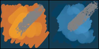
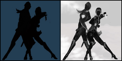
Shapes can be a great help to create a more appealing image. I tend to sketch in shadow/shape figures to check if a character or an object may look interesting (sorry for the crappy quality). You will also see that as soon as I add some values (in this case some grayscale elements) you actually start to see shapes and surfaces/textures thus the actual elements get more defined.
Forms are defined by values. If you add values to a shape you automatically create a form and it’s surface.
Colors:
Theoretical approach:
” Color is both value and hue. I think it includes how light or dark something is, plus what ‘tint’ and saturation something has.”
Artistic:
uhohh - ok - hmm - way too much to write here. Nothing about how colors work together or how they influence themselves but how they basically get created mayhaps?
Light is the main reason we see colors. Basically, if something looks green it means that all other light hues get absorbed and only the green parts of the spectrum gets bounced off into our eyes. That is also the reason you should always have your ambient color in mind because that is technically light that bounces off everywhere and influences all of the basic hues in your painting.
For me while painting I define colors by three main elements:
Hue, saturation and value (or to simplify it: brightness).
In Photoshop if you have the window with the color tab open you can chose to work with exactly those three elements. If you are not already working with the HSB (rings a bell?) Slider - you can go and click the little arrow at the top right to open a little menu and chose “HSB”.
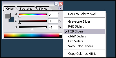
Hue is basically what we normally call “color”. You name it: yellow, orange, purple, pink…
Saturation means how much of the actual hue there is in the color. Screaming pink or neon colors are good examples for extreme saturation. Value we already covered
There is so much to colors - warm colors, cold colors, how they interact, complementary colors - yadda yadda - too much to write about really.
Besides colors are also a matter of taste and personal style. They help tell your story in a painting and can create certain feelings in the viewer. They can be like a character to your story.
Source: http://www.tascha.ch/content/index.php?option=com_content&task=view&id=18&Itemid=36 | 